UI / UX Design
Yukon University
ABOUT PROJECT
Yukon university's old app was way too old, It definitely needed a makeover and seems they came to the right person, yeah you guessed it right :)
One advantage that I had was that I already knew what features were working and priority of the others as it was a redesign not a design from scratch thing.
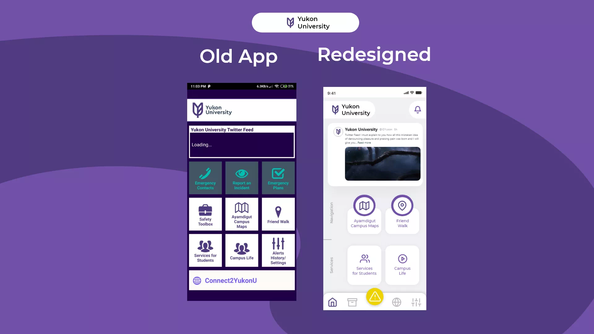
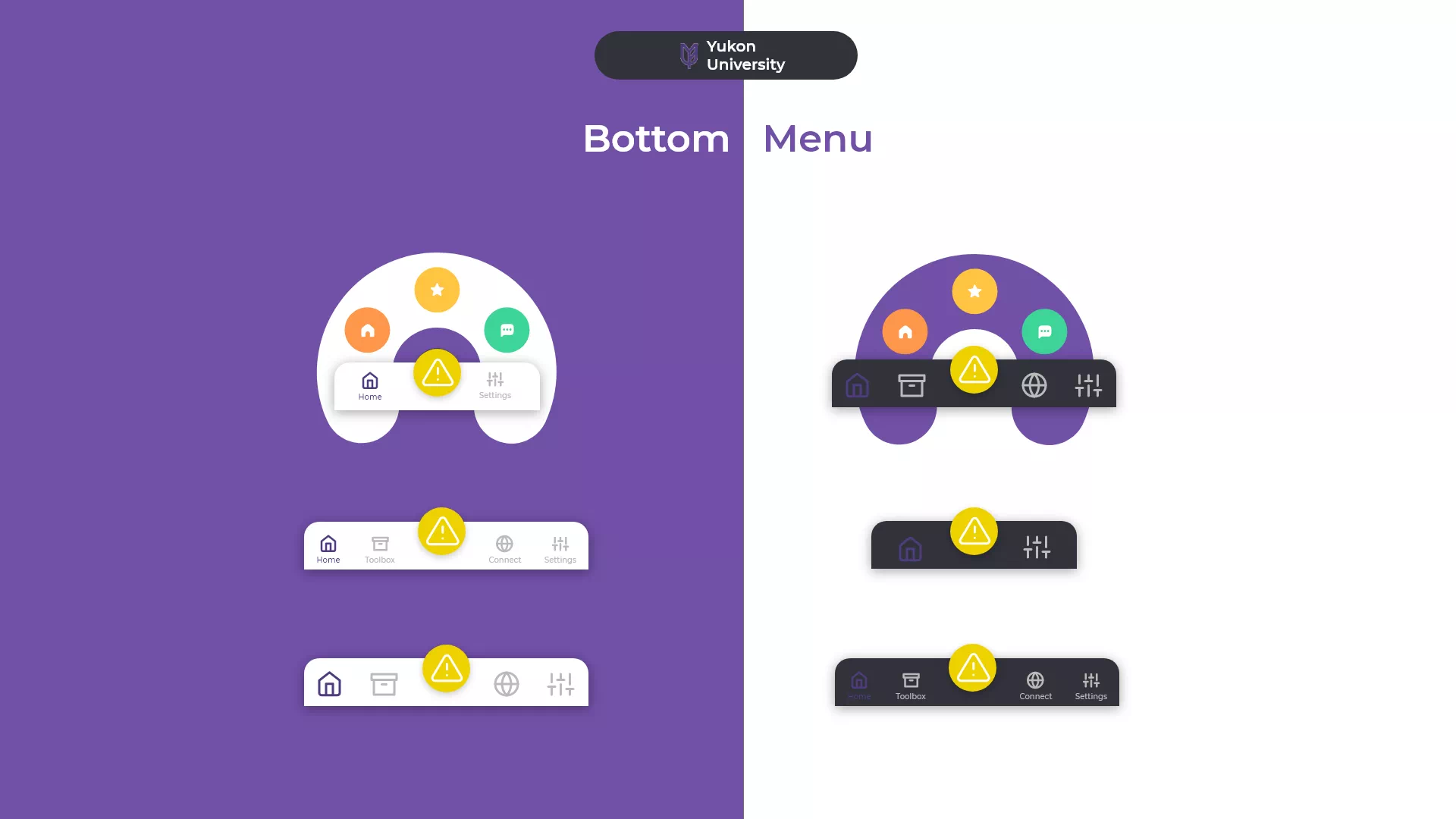
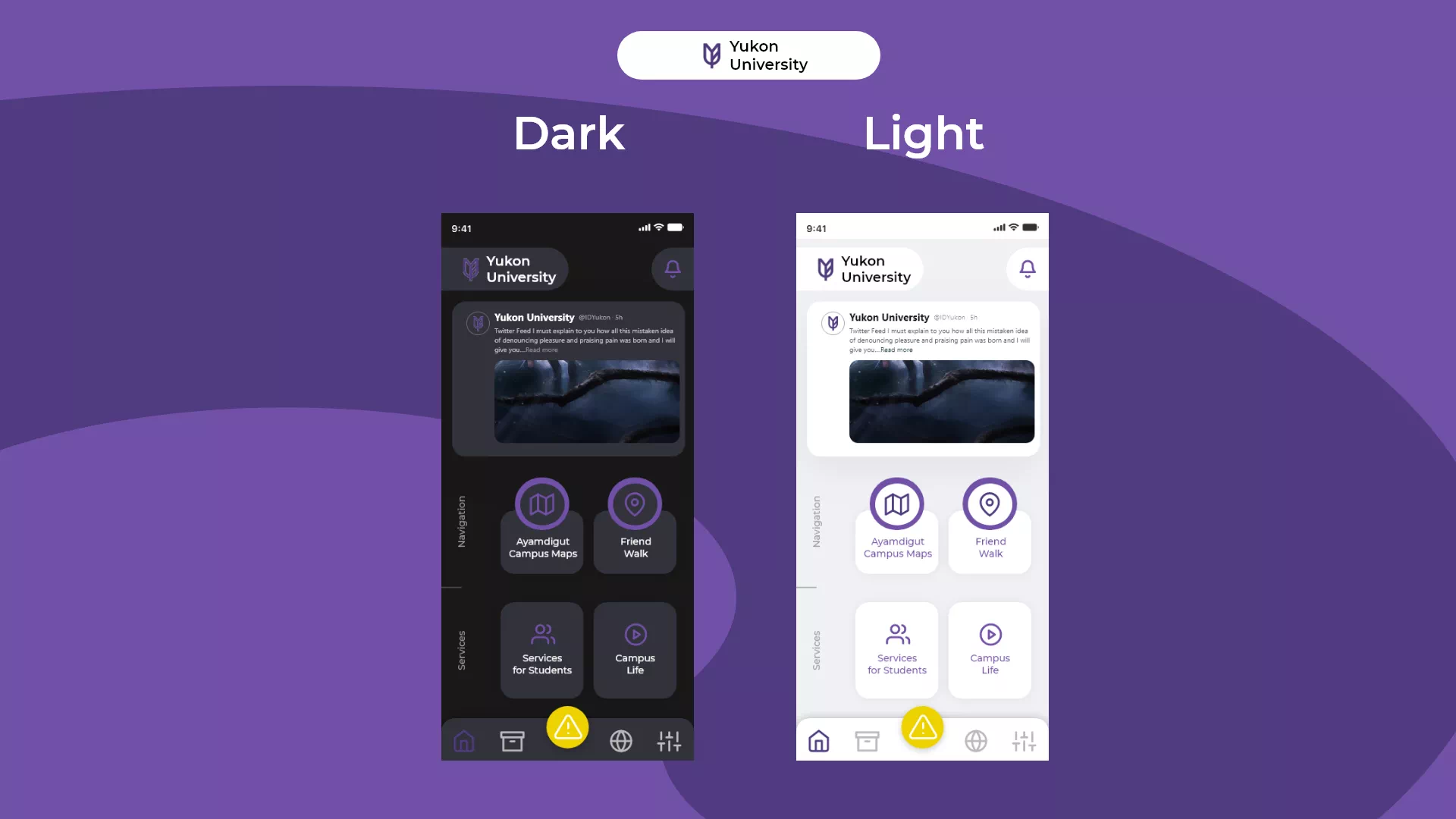
PROJECT APPROACH
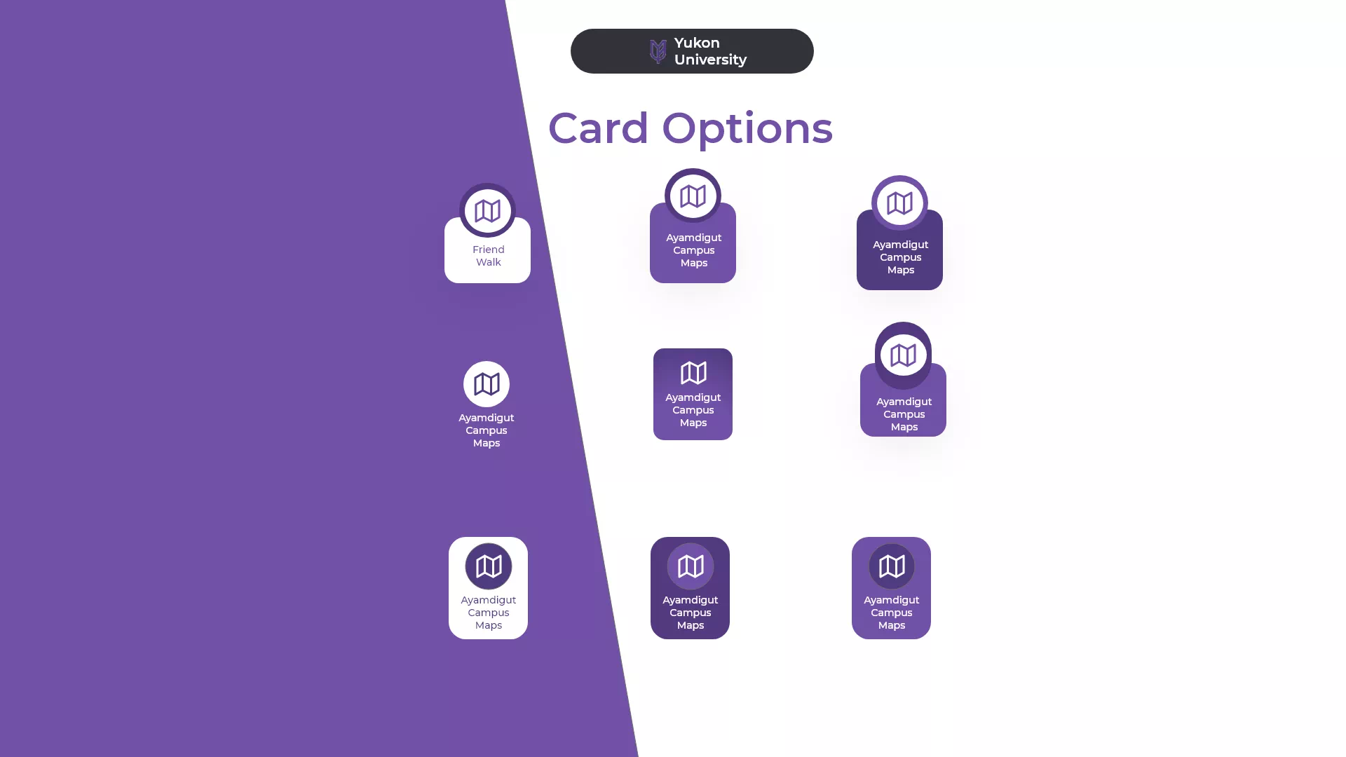
It had to be latest whether that was the card design, bottom menu or the feed. Color pallete was already defined and that did save time. Two shapes rectangle and circle were used.
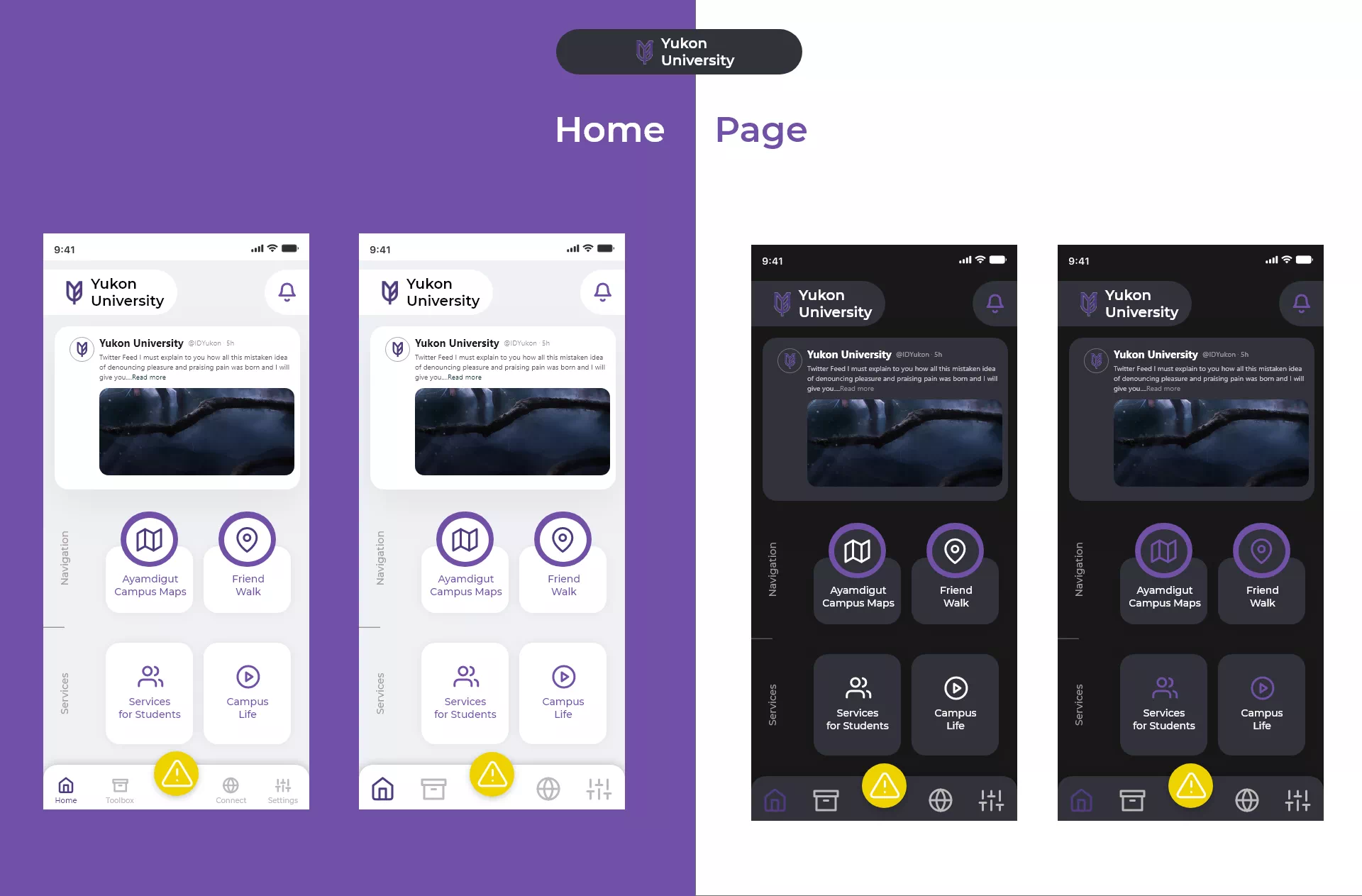
Bonus
There were a lot of options in the caution button but at the very same time, It's accessibility and visibility couldn't be tampered with, So, I went for an animation which popped upon making it easy to fit all emergency options.